 This is my mock up for my music magazine front cover. This was my very first idea, although i will change a few things for my final front page. In this i discuss the masthead, barcode, cover lines, date, main image and how my text should be a certain colour so it does not interfere with the background colour. I also talk about how i included a QR scanner seeing as it is getting quite popular these days and i thought it was a unique touch for my magazine.
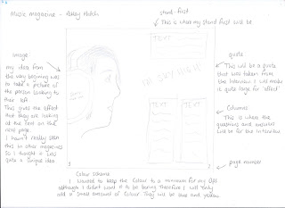
 This is my first mock up for my double page spread. I had the idea from the start to take a picture of the person looking to their left. This would give the effect that they are looking towards the text on the next page. I also mention the colour scheme which i say i want to keep to a minimum, although i didn't want it to look boring, so i will add only a small amount of colour, which will be yellow and blue which keeps in with the rest of the magazine.
This is my mo ck up for my contents page. I made my main image quite large because i thought if there was too much text, people would not want to read it. I also talked about how i added a "Dubstyle special" which is where readers might find some additional info and recieve some posters. In the editors note, i scaled my front cover page down and the text will say a quick thank you to all the readers.
 ck up for my contents page. I made my main image quite large because i thought if there was too much text, people would not want to read it. I also talked about how i added a "Dubstyle special" which is where readers might find some additional info and recieve some posters. In the editors note, i scaled my front cover page down and the text will say a quick thank you to all the readers.
No comments:
Post a Comment